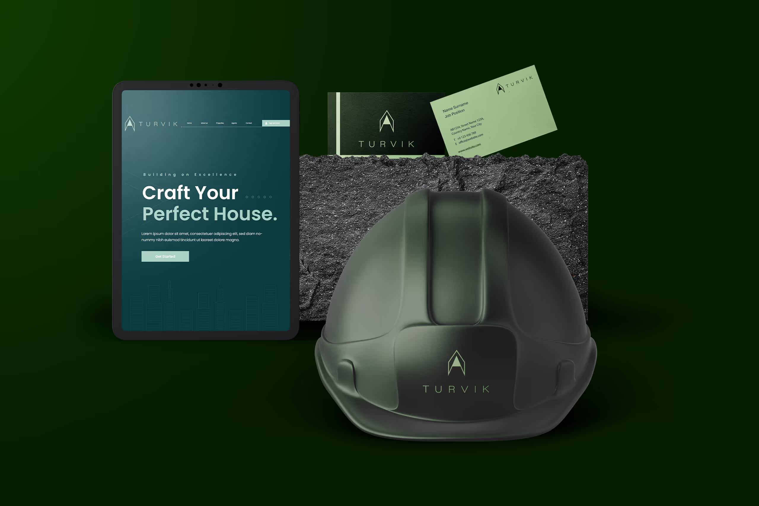
Let's build a greener tomorrow, together. We specialize in sustainable construction
Services
Client
Year
Website
Challenge
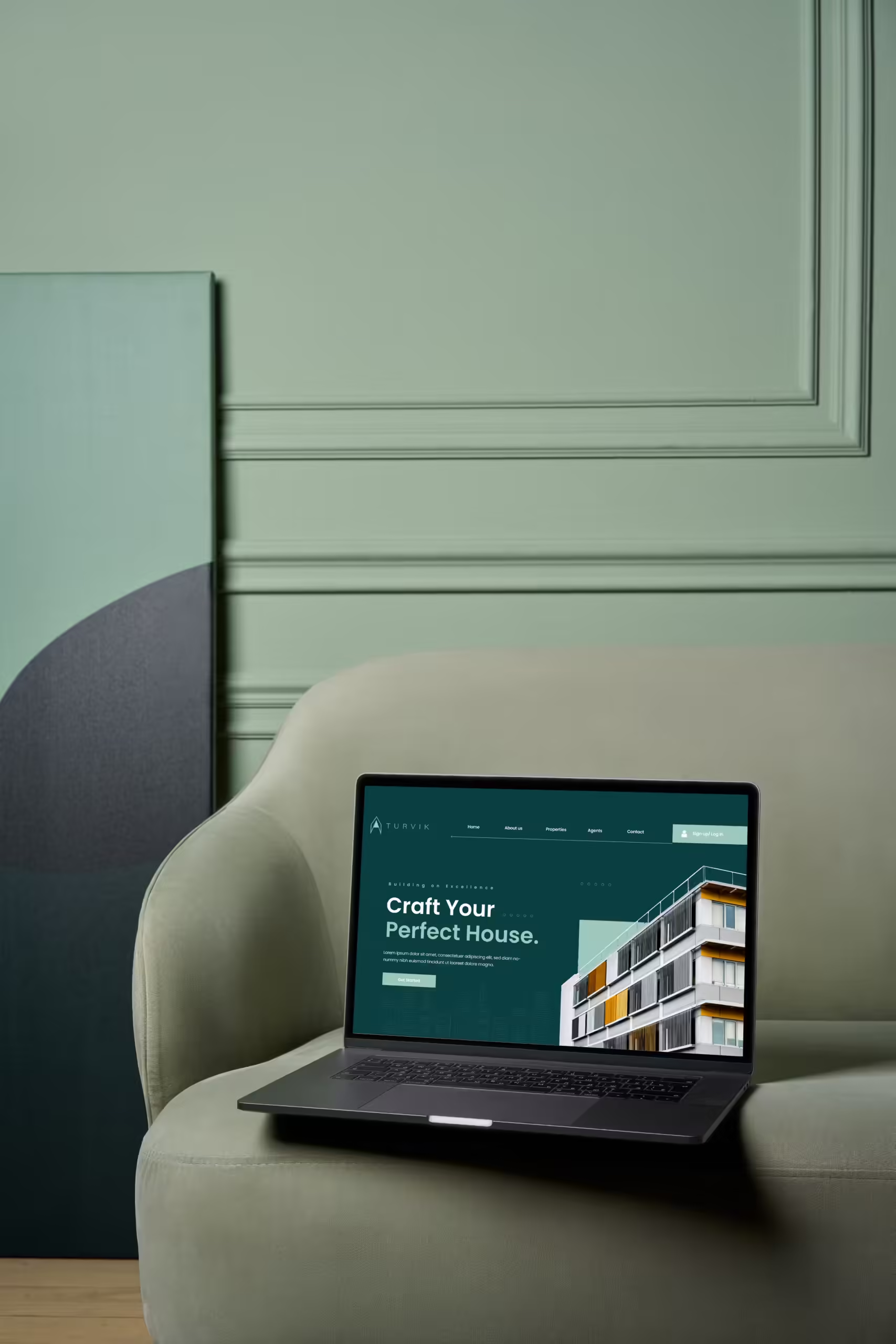
The Client needed to create a logo that clearly conveys the company's focus on sustainability, but also maintains a connection to the construction industry.
Using stereotypical “green” symbols like leaves or trees might be too obvious, while overly construction-oriented imagery might not communicate the sustainability aspect. Finding the right balance is key..
Many sustainable companies rely on overused symbols like recycled arrows, globes, or wind turbines. The challenge is to create a unique and memorable logo that stands out from the competition and effectively communicates the company’s commitment to eco-friendly practices
Goal
We needs to create a logo that feels current but also avoids relying on overly trendy elements that could become outdated quickly.
The field of sustainable construction is growing rapidly, and many companies use similar visual cues in their branding. We needs to find ways to differentiate the logo and make it stand out from the competition. This could involve using unexpected color combinations, unique typographic treatments of sustainability concepts.
Result
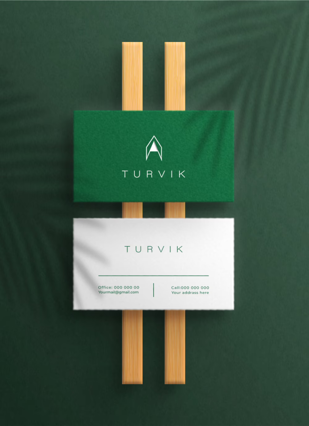
Clear communication and a well-presented exploration of design options fostered a collaborative environment within the client company, leading to a final logo that powerfully embodies their sustainability mission and resonates with all stakeholders.
The successful logo design helped the company stand out from the competition. The company’s unique visual identity became easily recognizable and contributed to building brand awareness and attracting environmentally conscious clients.
Building smart, building sustainably
Building smart, building sustainably
