Unlock Your Inner Glow. Radiant Skin Starts Here.
Challenge
Our client needed a brand refresh to better reflect their evolving business values and appeal to a younger demographic.
Designing Shekind, a kind-focused cosmetic brand, requires balancing a gentle aesthetic with a distinct identity, all while ensuring inclusivity and clear product communication for a diverse audience.
Shekind presents a unique challenge: leveraging the brand name as a springboard to redefine beauty inclusivity. This requires crafting visuals that celebrate kindness for all genders and backgrounds, while staying true to the inherent femininity of the name.

Goal
We did some intense market research, refined their brand message, and created a brand new look to truly showcase their identity.
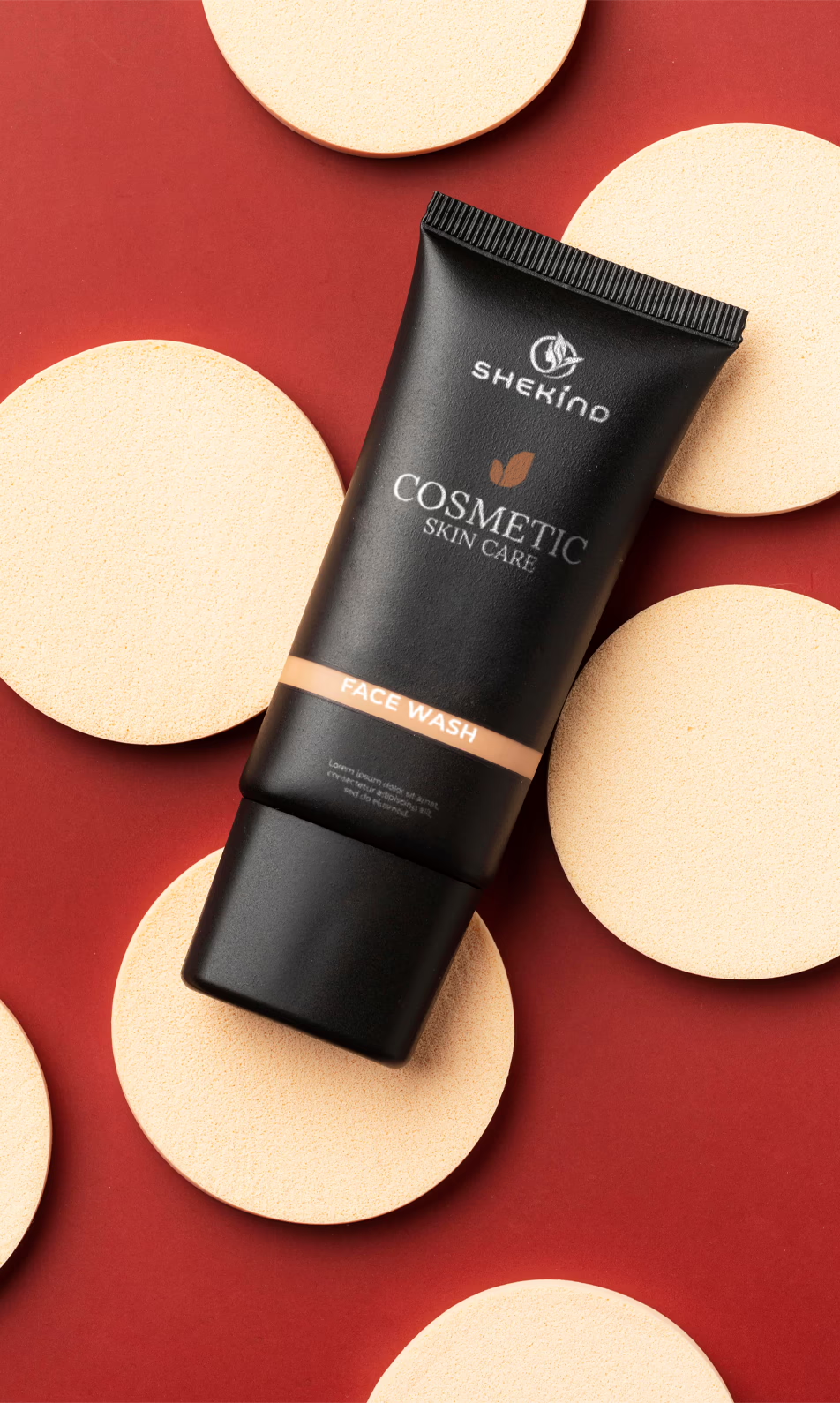
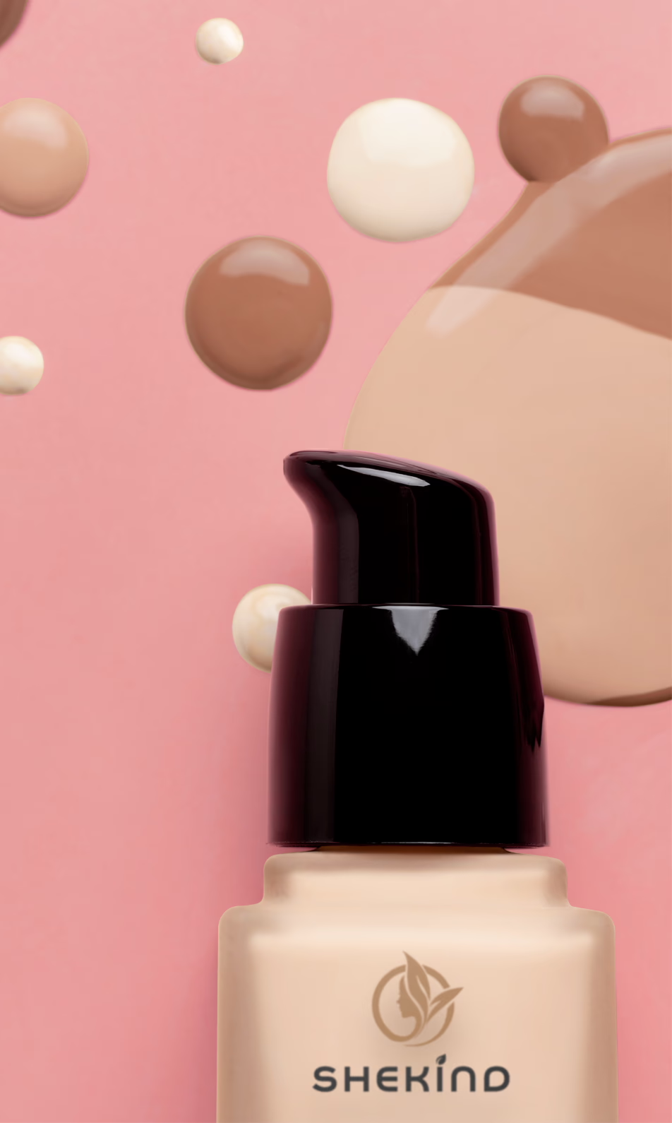
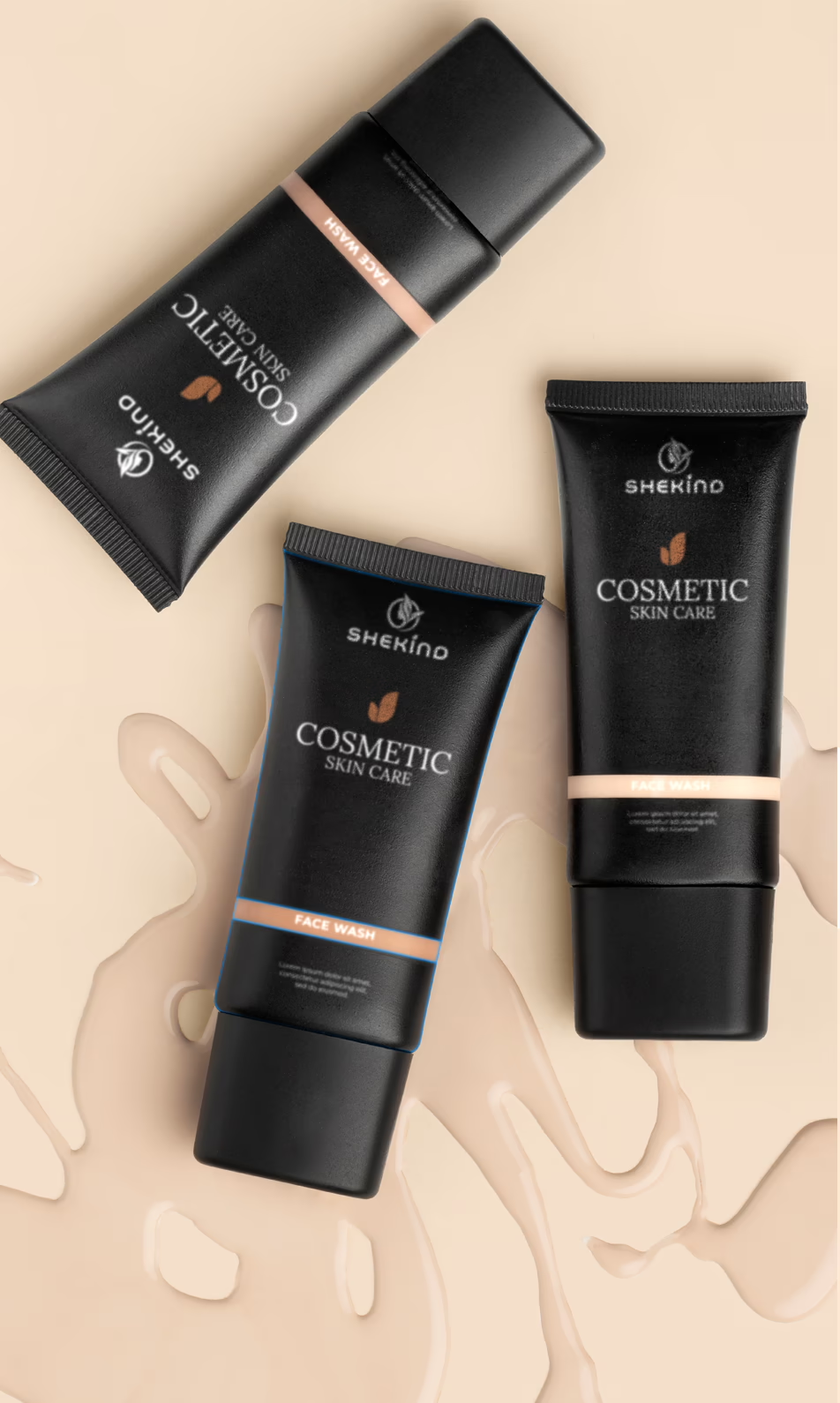
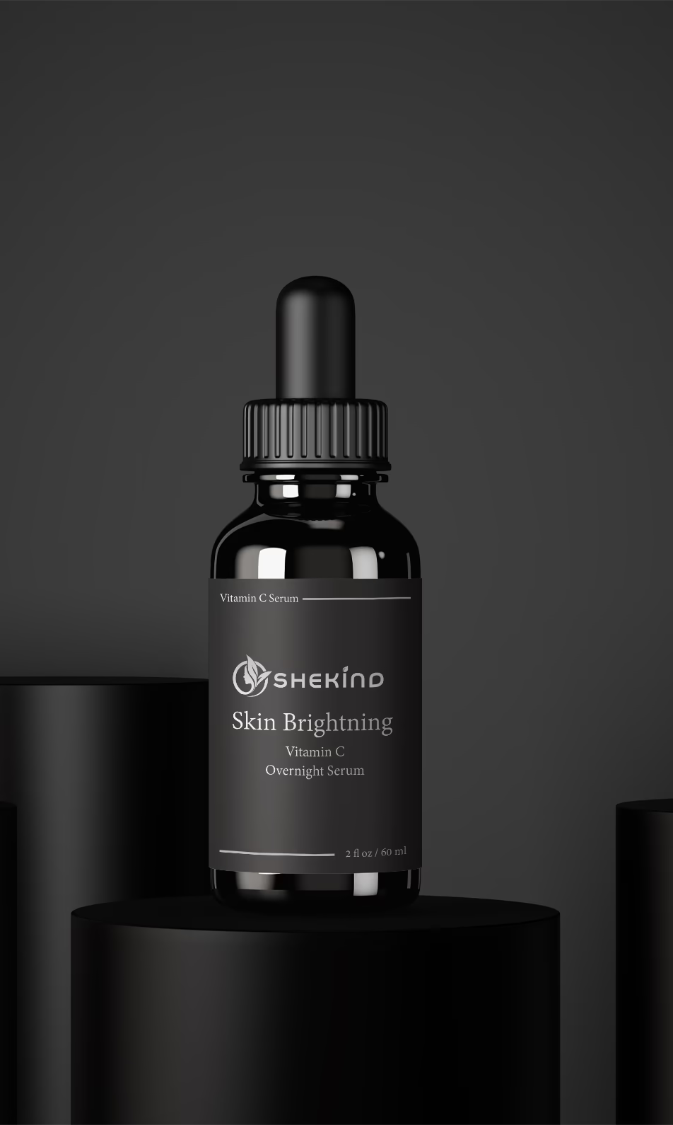
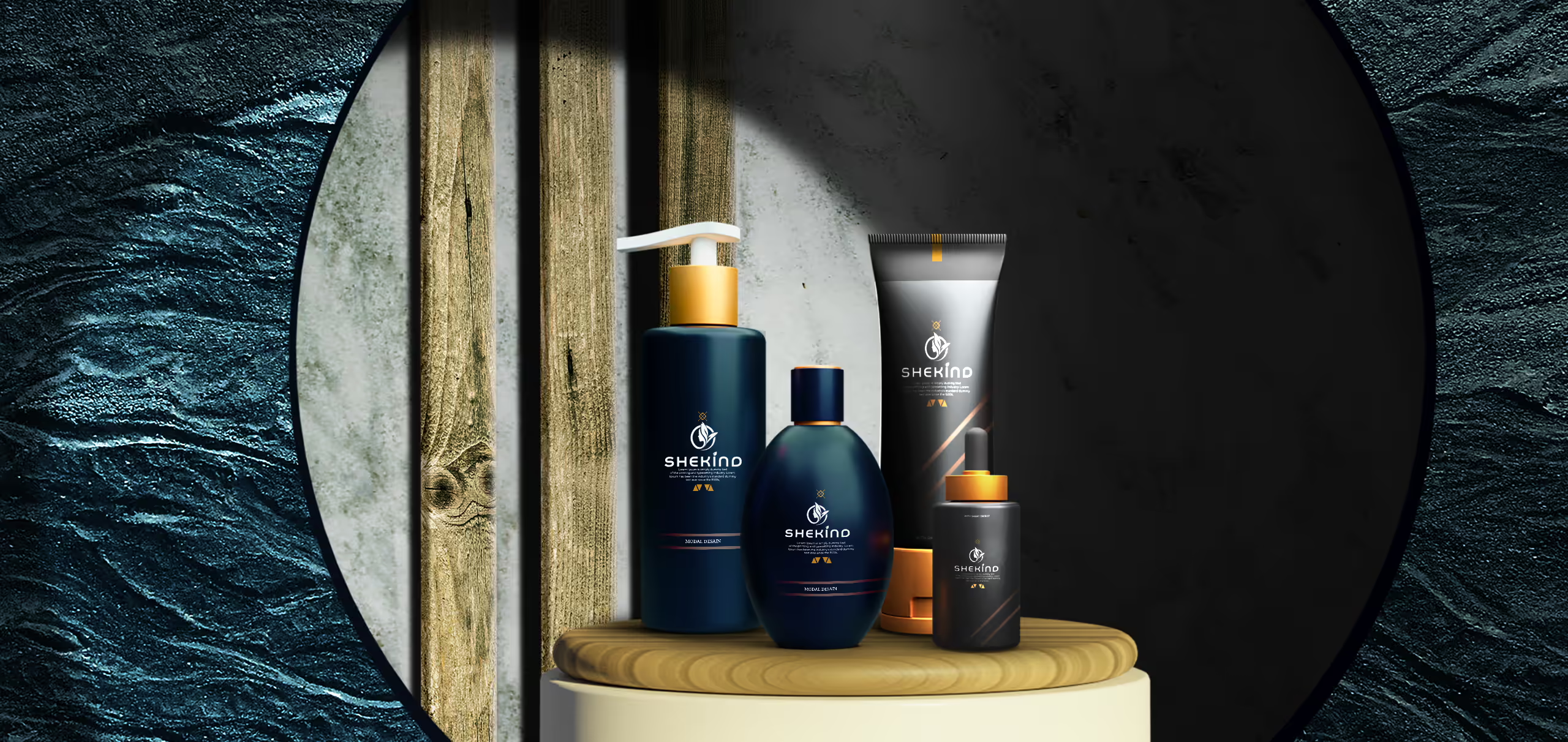
We’ve cracked the Shekind logo code! Imagine a design that balances gentle aesthetics with a bold identity. Soft shapes and an approachable font exude kindness, while an inclusive symbol (think connection or support) replaces clichés. The calming pastels infused with pops of vibrance color pallets. We can even tailor the logo of our client vision – a wordmark emphasizes kindness, while a lettermark/emblem offers impact and inclusivity. Th final design was versatile, scalable, and unforgettable, perfectly embodying Shekind’s message of kindness for all
Result
Shekind experienced increased customer engagement, a boost in sales, and a stronger brand presence in the market.
The comprehensive initiative, extending beyond visual changes, resonated authentically with the audience, resulting in heightened engagement metrics and a tangible boost in sales. The company now stands on a more robust foundation, embodying a stronger and more compelling brand presence, setting the stage for continued success in the competitive market.
Enchantique brands. Where elegance converges with brand brilliance.

Enchantique brands. Where elegance converges with brand brilliance.
